Vega. First boot,
on our own code.
The same login screen we shipped to Web and Android TV — now rendering on the Vega dev kit. Two days and nights fighting the Metro resolver to pipe it in: Vega's SDK, node_modules topology, and Kepler SDK resolution all diverge from our defaults.
One test suite, every platform.
{''} Playwright-style testsTest Framework
The Product.
Zattoo is a streaming company, and we make streaming easy, on whatever device or technology you bring.

Meeting people in the moments they live
We ship to every screen that can stream media.
Most of our viewing lives in the living room.
Three platforms, multiplied
into hundreds of apps to ship.
Every new platform multiplied our effort
instead of extending it.
Platform-centric development: high duplication.
Each platform has its own app logic, tests, technology, and team.
-
{[
'Repeated implementation',
'Slower delivery',
'Higher maintenance cost',
'New platform means more duplicated work',
'Coordination overhead',
].map((t, i) => (
- {t} ))}
PWA 2019–2020.
PWA looked like the future of cross-platform delivery, but it worked well only in selected cases.
-
{c.bullets.map((b, bi) =>
- {b} )}
Cross-platform candidates 2021 – 2022.
About a year or two after the PWA rollout, we started looking closely at cross-platform frameworks.
-
{c.bullets.map((b, bi) =>
- {b} )}
An invitation from
Amazon called us in alongside a handful of streaming developers to a demo at their Berlin office. They laid out the vision. Mind-blowing.
React Native: SWOT.
Honest reflection on strength, weakness, opportunities and threats.
-
{q.items.map((t, ti) =>
- {t} )}
Some saw a chance to build for Amazon.
We saw a chance to build with them.
The partnership gave us a platform we could grow into. The technology underneath was exactly what we needed — across Apple, Android, and Web too.
Engaged early adopters, giving real feedback as Amazon built the operating system. Active community members on the React-Native-for-TV side. And a known product already in the Fire TV app portfolio.
Fire TV is the biggest chunk of our German viewers. The same foundation we’d build for Vega could carry across our whole stack.
One team is only one team
when it ships one codebase.
Otherwise it's just engineers sitting in the same channel, still shipping three different apps.
Strategic importance was clear,
but the roadmap was full,
and engineering capacity was already allocated.
One engineer. Two sprints. Our existing codebase.
We proceeded with the suggestion — narrow on purpose. Time-boxed so it wouldn’t compete with ongoing work.
-
One engineer
Someone who had never written a line of React Native. If they could get there, the rest of the team could too.
-
A couple of sprints
Time-boxed so it wouldn’t compete with ongoing work or commit headcount.
-
Existing codebase
Not a fresh project. Could our existing investment carry into this new world?
It actually worked.
A small slice of the stream app — built in two sprints, running on Web and Android TV.
Not just that we could build on RN.
That we could build on RN starting from where we already were.
The new CTO called the front-end stack
"Resource Intensive Frontend."
The prototype turned into a CTO-level answer — UTV launched for real.
UTV started as just another project.
Existing apps stayed live and shipping the whole time. UTV piped into the same shared lib/ rather than growing its own copy.
Nothing already running had to change for UTV to begin. Migrations don’t have to mean reset.
- Existing projects kept shipping
- Shared lib stayed shared
- UTV could grow without freezing the org
Build-time overrides — not runtime branches.
When something must differ per platform, the difference lives in a sibling file. The resolver picks the right one at bundle time.
- Platform-specific
- .native (any non-web)
- Universal .js
Escape hatches, kept small.
A focused set of modules — different on each platform — bridging the universal JS layer to platform-specific capabilities.
The entire Vega-specific surface lives in roughly one file — playback, wrapping Amazon’s video APIs. Everything else is shared.
Product look on migration.
We deliberately separated technical migration from product redesign: keep the Zattoo experience familiar, improve where it mattered, and preserve existing features.
Mitosis.
UTV split into two stream-aligned squads, Nova and Luna, supported by a Principal Engineers enabling team.
engineers
Humble Start.
One team handled platform, feature, video, and technology together — no specialisation yet.
Scale & Learn.
Balance device complexity, feature parity, functional excellence, and scalability.
engineers
As of today.
Clear ownership and interfaces lead to operational efficiency.
Engineers
Team
The journey.
The organisation evolved step by step: start small, add expertise, scale with mentorship and platform support, then align teams to product domains.
business and
technology
teams for
fast flow
RUTH
MALAN
and MANUEL PAIS
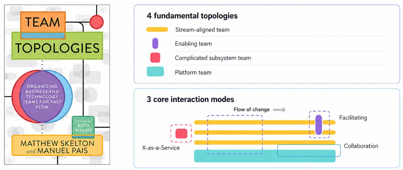
Team Topologies.
Team Topologies offers a strategic framework for modern organisational design, helping software teams improve flow, clarity, and delivery.
Transforming the organisation.
We chose to transform our org and operating model building UTV while still supporting the native apps.
Some improvements we couldn't resist.
Migration kept the UX familiar — but a few pain points were too painful to leave alone. Typing a password on a TV remote was one of them.
Typing on a TV remote was painful, so we hung an exit door on the screen.
Scan the QR code, finish recovery on your phone. Done in seconds.
Beta users share their experiences.
Representative beta feedback grouped into positive, neutral, and negative themes.
Organised by domain, not by platform.
The code mirrors the org — so we organised the code by domain to let the org reshape around it.
End-to-End Ownership.
Move from platform-based feature ownership to clear ownership in end-to-end teams.
: null}{' '}
Vega and Web are closer than they look.
Vega via Hermes + Fabric onto a Linux/C++ surface. Web via react-native-web to the DOM. Neither passes through a native view system.
On Android and Apple, where the native view bridges need more care. Abstract first, override only where you must stops being a discipline and becomes the natural shape of the work.
The bet paid off.
Product learnings.
The win is that we can now move faster.
Three decisions we’d defend without hesitation.
The architecture decisions that reduced long-term complexity were worth it. Next time, we would strengthen the foundations earlier.
RN treats "iOS" and "Android" as the world. They aren’t — they’re slices.
Apple is iOS plus tvOS, watchOS, visionOS. Android is phones plus TV, automotive, Fire OS, Vega. Step off the mobile path and you’re on your own.
No first-class RN core support. tvOS lives in the community react-native-tvos fork.
Ships, but TV-specific concerns — focus management, remote-control input, leanback — aren’t owned by the framework.
Web via community react-native-web. Vega via Amazon’s Kepler SDK. Neither sits in RN’s mental model.
From vision to operational reality.
What began as Amazon’s mysterious invitation has become Zattoo’s operational reality.
Not aiming for 100% reuse between big screen and mobile. 80% shared, 20% platform-specific where UX demands it. Pragmatic over pure.
The squad+chapter model evolves as our platform footprint grows. Annual review of org design.
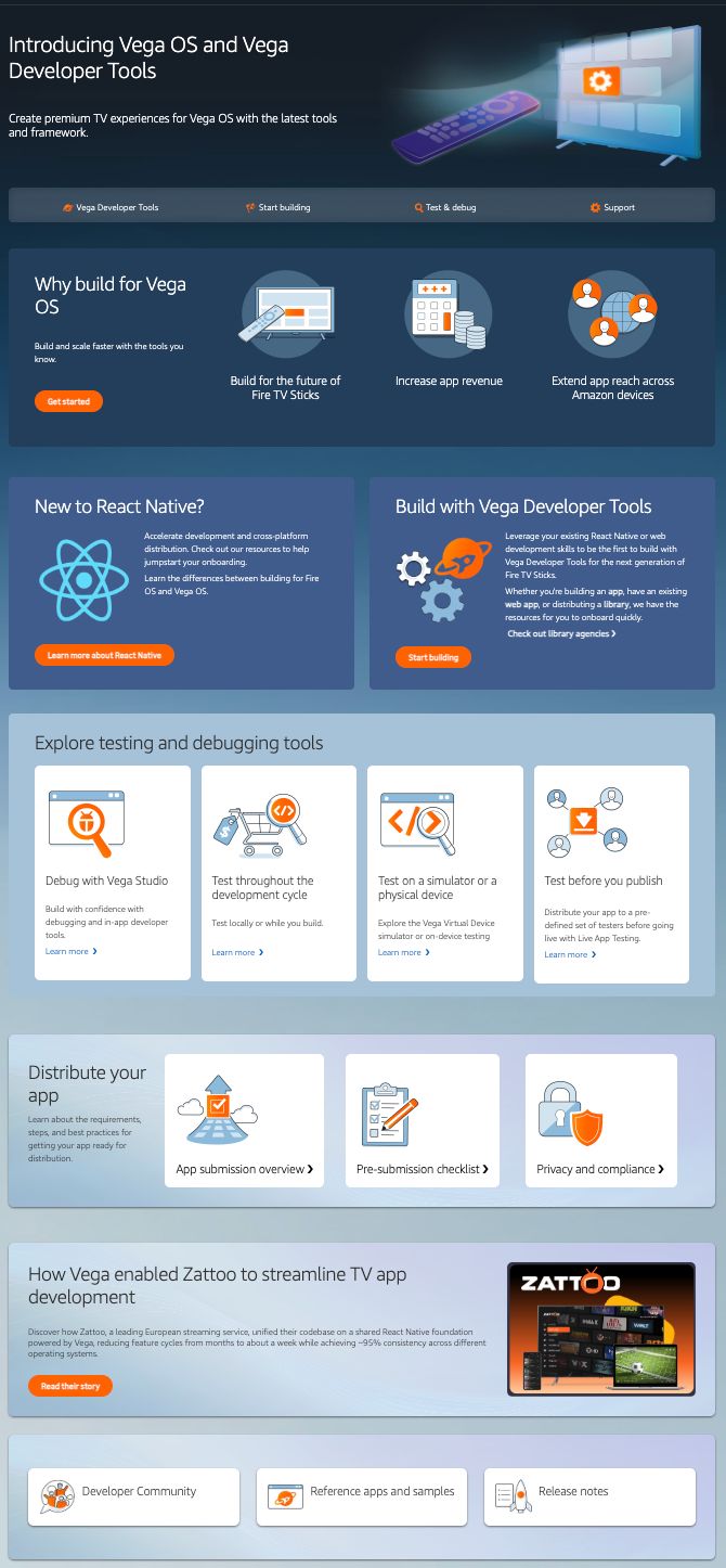
Success story.
Featured as a case study on the Vega Developer Portal.